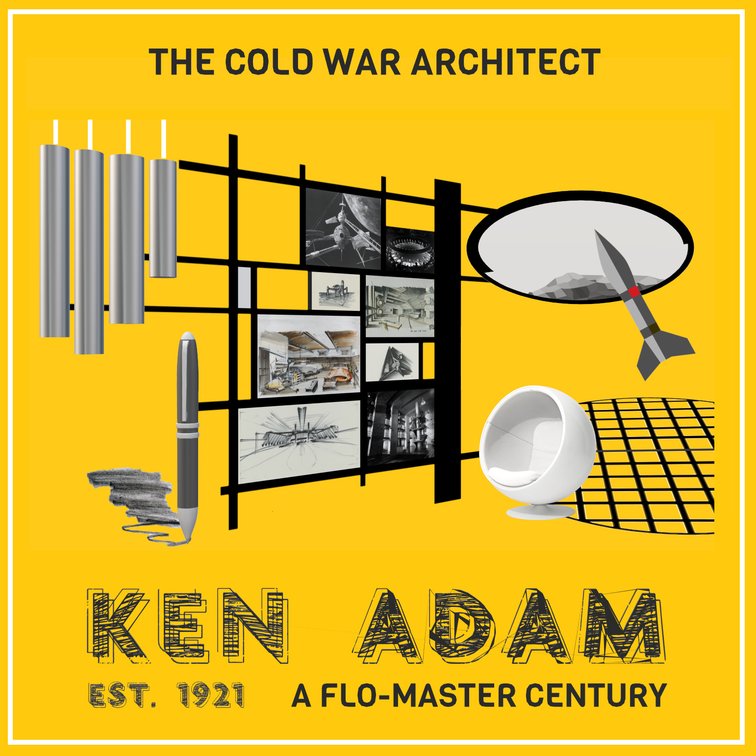
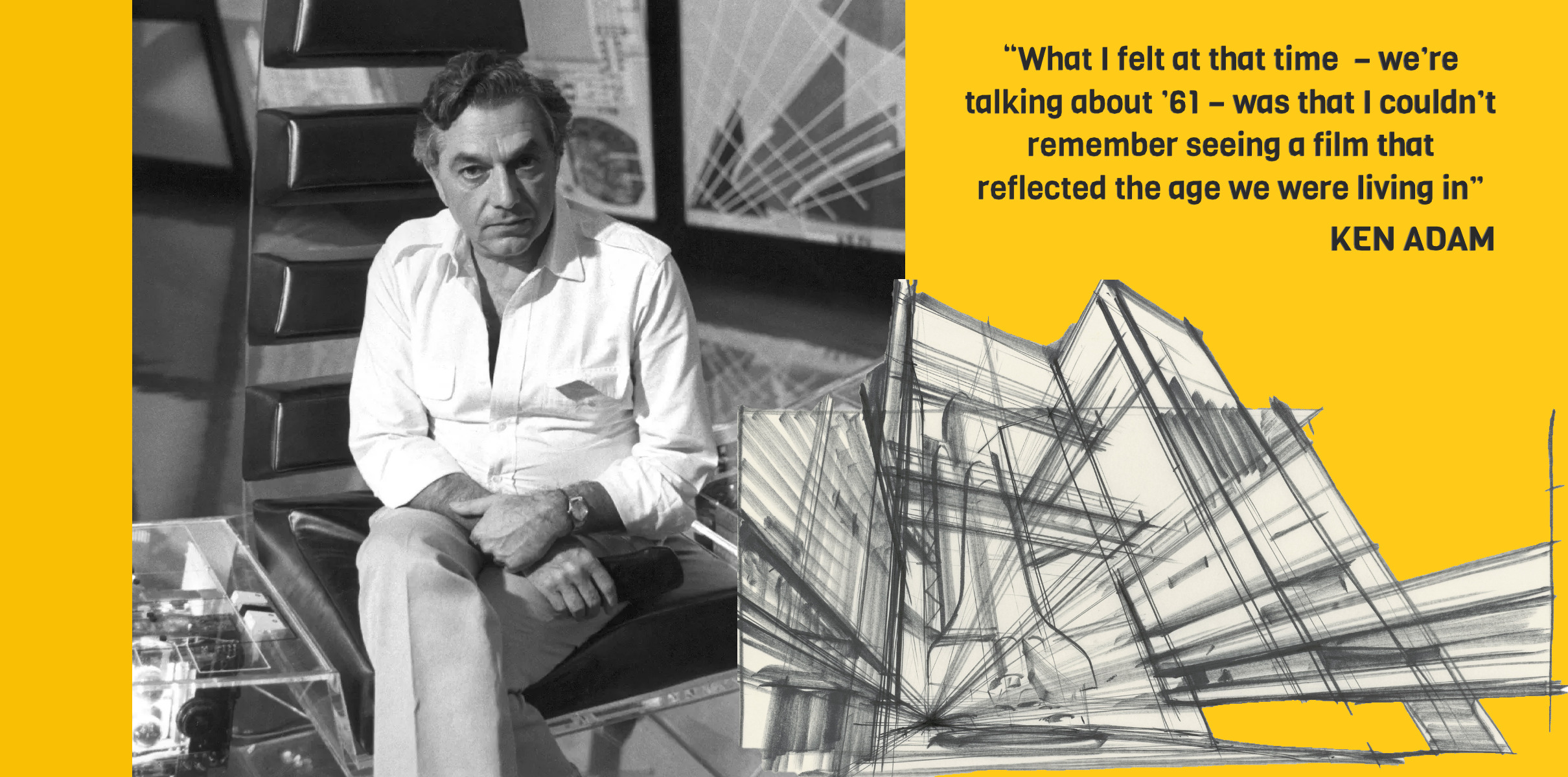
Born in Berlin in 1921 and later one of a small handful of German RAF pilots in the Second World War, the production design genius Sir Kenneth Adam changed more than just movie artistry. His seven films drawing for 007 did not just set the standard. They were the standard. And seven decades later, they still are. With his faithful Flo-Master pens, architectural eye meets Dr. Caligari perspectives via trademark charcoal contouring, Adam’s work on Bond alone changed the size of the movies. Before Ken Adam, the size and scale of Hollywood was the arena of biblical epics, massive Californian-shot sandals and swords follies, showbiz soap operas, pirate adventures and the interior soundstage world of the musical.
However, a post-war generation of audiences and movie creatives were sensing the era of the new. And the now. As the likes of Alfred Hitchcock, Elia Kazan and Otto Preminger were forging through the 1950s with a new modernism, new soundscapes and an Actors Studio sense of realism, the production artistry of western cinema was about to shift. Suddenly, the titles, art direction and color of Rear Window (1954), Vertigo (1958) and North by Northwest (1959) had design scale. The baroque, theatrical expanse of a historical drama could also now be the modern world of A Streetcar Named Desire (1951) and On the Waterfront (1954).
Ironically, as Hollywood and American cinema was synchronizing itself with younger markets, teenagers, the contemporary dollars of Elvis musicals and social dramas looking at the working class condition, Ken Adam was about to get the attention of three movie men still creating biblical epics, war films and historical capers. Director Stanley Kubrick and producers Albert R. Broccoli and Harry Saltzman were about to be Anglo-American cinema men – with British roots in British studios. Yet, at the end of the 1950s all three were biding their time and paying their contract dues with a yesteryear sense of Hollywood storytelling – through history titles such as The Red Beret (1953), Hell Below Zero (1954), The Black Knight (1954), Paths of Glory (1957) and Spartacus (1960).
Yet, the 1960s – and 1960s Hollywood – had their sights on making less films celebrating war, your parents’ battles and tall ship heroism. Popular culture, music, fashion, sexual politics and cinema were about to get an upgrade – in curiously similar ways to the Berlin of 1930s and a young Ken’s formative years. With a post-war confidence and a more youthful vitality calling the shots in the early 1960s, the Cold War may have been propelled by the atomic age of the 1950s. But, it had yet to find its mainstream cinematic equivalent of the 1950s war movie. Cue Ken Adam.
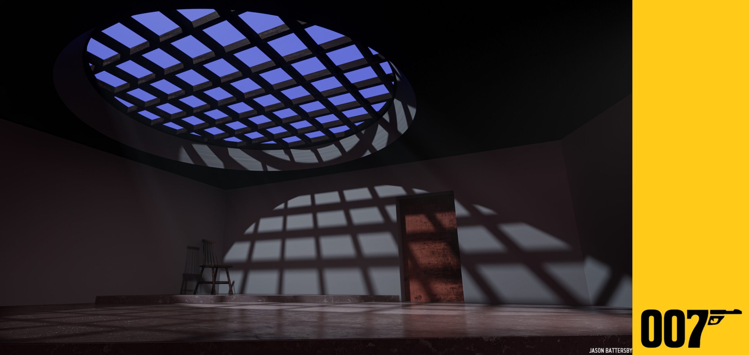
Artist Jason Battersby digitally re-creates Ken Adam’s Tarantula Room from Dr. No (2020)
Whilst he got the attention of Broccoli via designing the very Victorian The Trials of Oscar Wilde (1960), Ken Adam was about to look beyond the frills and lace of 1950s historical dramas for the very modern missiles, interiors, automobiles, bedrooms, office walls and villains of the Cold War. When Adam fully joined the Bond team and EON Productions in 1961 with Dr. No (1962), his Flo-Master ink created a line away from designing the ‘sword and sandals’ dud Sodom and Gomorrah (1962) to the new-era likes of Jane Fonda (In the Cool of the Day, 1963), Sean Connery (Goldfinger, 1964) and Kubrick (Dr. Strangelove – Or How I Learned to Stop Worrying and Love the Bomb, 1964). Whilst Dr. No (1962) arguably achieved as much visually as Goldfinger (Adam’s tarantula room alone is university-taught fare), the first Bond bullet and its follow-up From Russia with Love (1963) were still arguably bound to a 1950s Warwick Films ethic – a Kennedy era late 1950s of A-lined hems, British chaps and nuclear modernism. And then Goldfinger happened.
“Like all institutions that must safeguard their survival, the Bond series adapts and adopts. Three films in and we already recognise where the villains, heroes and those in between are positioned. The film’s glossy calling-card of dousing Jill Masterson (Shirley Eaton) in gold paint is not just a proficient and nasty way of telling the audience all we need to know about Auric Goldfinger. It tells us what this film series now wants to be – bespoke action adventures, a little bit kinky, a little bit violent, often original, always stylish, yet forever aimed at mass audiences. The Bond films are now in the business of showing their intent rather than telling it.”
‘The Designer Bullets’, Catching Bullets – Memoirs of Bond Fan
The responsibility of the telling fell on the drawing boards of Ken Adam. Goldfinger is more than just a silver DB5, a torch song triumph and one of pop-culture’s gilded capers. It is about when the Bond movies started moving. It is when Broccoli, Saltzman and the founding creative fathers of Bond cut the Fleming apron strings for a new visual template of modernism, contrasting materials, quirky manoeuvres, jet-set opulence, and a scale of sizeable intent that informed the narrative rather than idly flanking it. The laser room, Fort Knox, Goldfinger’s jet, Q’s Lab, the Ben-Hur minded acoutrements of a brand new Aston Martin, a rumpus room with a moving floor and a Miami hotel suite – they all brought movement and a pop-art scale to 007. And Ken Adam was responsible for them all.
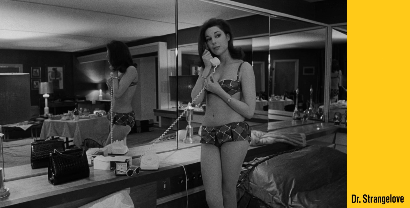
Collectively, Ken Adam’s Bond work was the benchmark – the granite-hued monolith of Cold War design encompassing new materials, surfaces and minerals that forged a penthouse sense of glamour, and made death big and global destruction totally luxurious. The famous War Room set for Kubrick and Dr. Strangelove (1964) may have influenced design students, studio draughtsmen and gullible Presidents for ever more. However, this Adam aficionado believes it is his work for George C. Scott’s hotel room where Adam truly soars in Kubrick’s wry ode to nuclear destruction. An almost non-descript moment, the whole scene of Scott taking a plot-initiating phone call via his mistress is all achieved in one take. Yet, Adam breaks the rules from the get-go. He incorporates carefully positioned mirrors to not only hide Kubrick’s cameras, but to create three points of action involving three characters and three conversations. Adam’s sense of placement and perspective makes the audience assume the scene has a wealth of guiding cuts. It doesn’t. It is all Ken Adam and Kubrick allowing production design – and contemporary, diegetic production design – to further the story more than any dialogue or edit. That visual shorthand is why his Bond work is so vital to the franchise. Adams introduced EON Productions to the language of design and its ability to further a 007 caper more than perhaps the cerebral, dialogue-led worlds of Dr. No and From Russia with Love.
Over seven films and twenty-five years, Ken Adam’s Bond work was all very individual and rarely repeated itself. Dr. No (1962) introduced his contrasting use of nature, timber and trees, antique furniture and faux minerals to enhance a villain’s downtime alongside an angled gantry world and the glories of those nuclear perspectives.
‘After we encounter Dr. No – his voice anyway – on the island of Crab Key, I adopted a slightly tongue-in-cheek, slightly ahead-of-contemporary approach: the mixture of antique and modern in his underground apartment, with the Goya Wellington portrait popped up on the couch and a magnified aquarium in the stone wall.’
Ken Adam / Ken Adam Designs the Movies : James Bond and Beyond
Goldfinger gave a cathedral of gold, another round roof grille, a timbered gas chamber-cum-pool room all framed and advanced through metallic greys and silvers (a dream for early 1960s cinematographers wanting to gild their Bond caper with a futurism and a use of gold that met audience members in the poster-adorned cinema lobby and kept with them until Honor Blackman embraces Sean Connery in her gold top-wearing embrace as the credits roll). Everything we need to know about Auric Goldfinger is not there in the dialogue, costume or plotting. It is there in a laser table – an edgy visual beat that saw Ken Adam allow everything about the Bond template to fall into place forever more. His Bond work on Bond ’64 was futuristic without being sci-fi, opulent without being gauche and cool without ever ageing. Goldfinger also saw Adam join up with Bond’s VFX and props teams and Aston Martin to create the silver chariot of motion picture automobiles – the DB5. Its impact on Bond, cinema and British culture is manifold. Almost six decades later and that car and its tricks is still the literal poster boy for 007 as it tears across the streets of Italy’s Matera (the location Ken Adam had himself help put on the movie location map when he chose Matera in which to build and shoot Bruce Beresford’s King David in 1985).
Thunderball (1965) takes the global Bond phenomenon and its influx of younger audiences with a lot of Gerry Anderson era kit, vehicles, miniatures, metal conference suites governed by faceless men hidden behind metal blinds, boats that split into two, shark pools, and a baroque, Victorian Whitehall versus the metallic futurism of S.P.E.C.T.R.E.
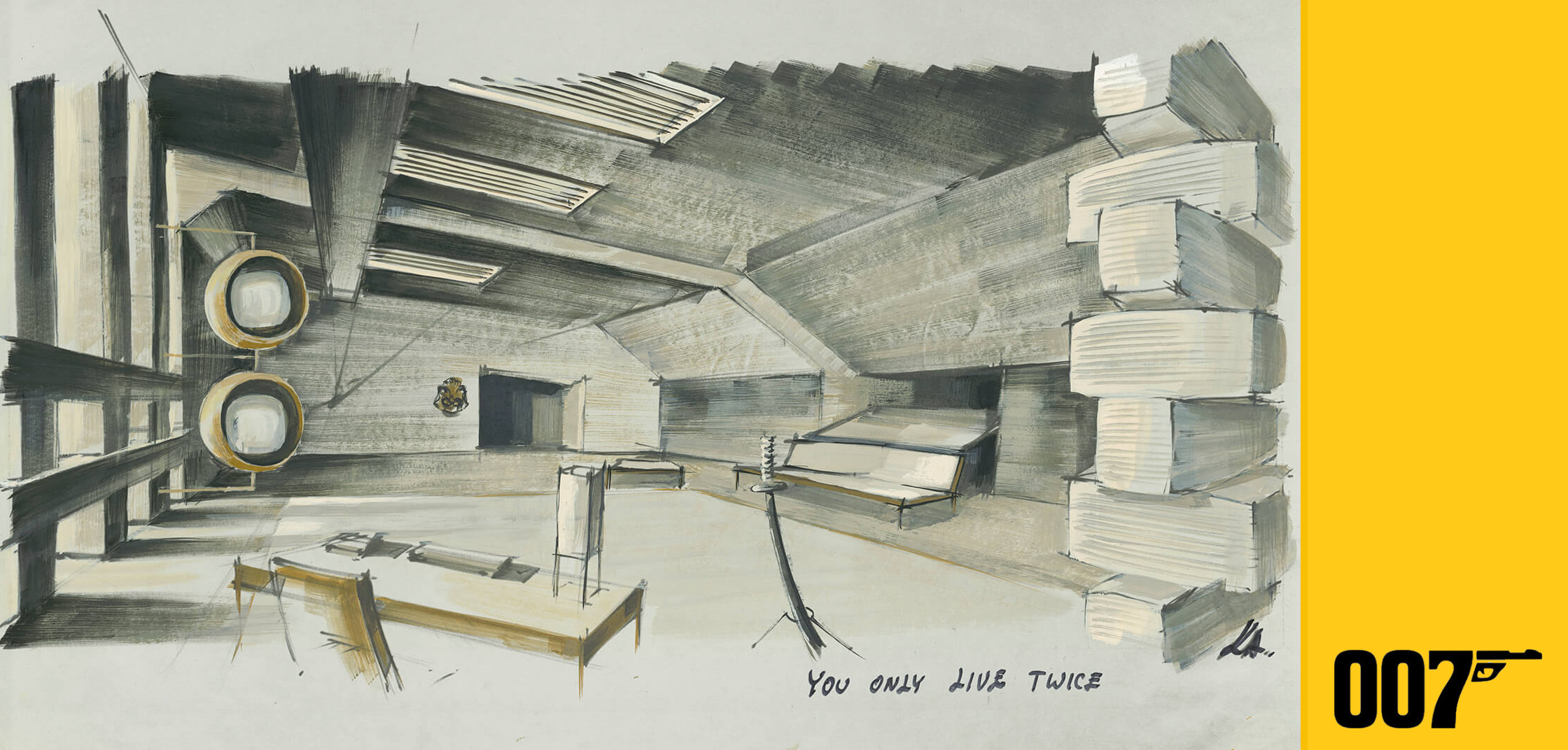
You Only Live Twice (1967) sees Adam make Bond truly big for the first time. It is not just the legendary volcano build on the Pinewood backlot that housed the sci-fi intent of a pop-art phenomenon. It was the size of the gestures and imagination that Ken Adam gave the fifth 007 bullet – whether it was a wood-framed bed that would spring into the wall to navigate the censors not keen on seeing Sean Connery being machine gunned to death, the Japanese interiors suggesting a total distance from London and Britain (and that are all over Bong Joon-Ho’s Parasite, 2019), the idea of screens, cameras and surveillance, a penthouse office created from stainless steel, paper screens and split-levels, and an underground sense of tunnels and trains suggesting wider networks and spy intrigue at play. Adam followed Bond’s fifth bullet with EON Productions side-bar adaptation of Ian Fleming’s Chitty Chitty Bang Bang (1968) – where the rich golden designs saw the car-loving Ken in his vehicular element.
“Mr. Adam never saw a circle that he couldn’t stretch into an oval, a right angle that he couldn’t squeeze into a dagger point, a horizontal or vertical line that he couldn’t tip over to a diagonal.”
The Economist, March 2016
Diamonds are Forever (1971) takes that corporate villain’s glamour to the next level. It is a film all about lobbies, midnight cabaret and downtime relaxing – from a glass fish tank bed to glam bathtubs, the homes of gem smugglers and the Whitehall exchange of Bond and M having drinks at night. And all mixed with a dutch-tilted sense of comic book escapism, modernistic stained-glass crematoriums, and comic-book plastic surgery centres… in a cave. Just as the costly volcanoes of 1967 pushed the designer to grandiose levels of brilliance, Bond ’71 also sees Adam and director Guy Hamilton opt for the total opposite – as pipes, small elevators, coffins, more elevators, dressing rooms and oil-rig store cupboards house the plot as much as Blofeld’s magnificent Vegas lounge. Diamonds also sees Adam working with a very real and design-aware town. Those Las Vegas casino tunnels, concrete stairwells and backroom offices are all rooted in a Nevada reality. As is one of the best Ken Adam sets that is not actually a Ken Adam set – the delicious Elrod House in Palm Springs that serves as Willard Whyte’s trapped bachelor pad and is a very real and beautiful home built a year before production. Architect Arthur Elrod was definitely working within the same domestic, late 1960s aesthetic as Ken Adam – which is also where the latter’s influence starts to take hold and begins a legacy away from the silver screen.
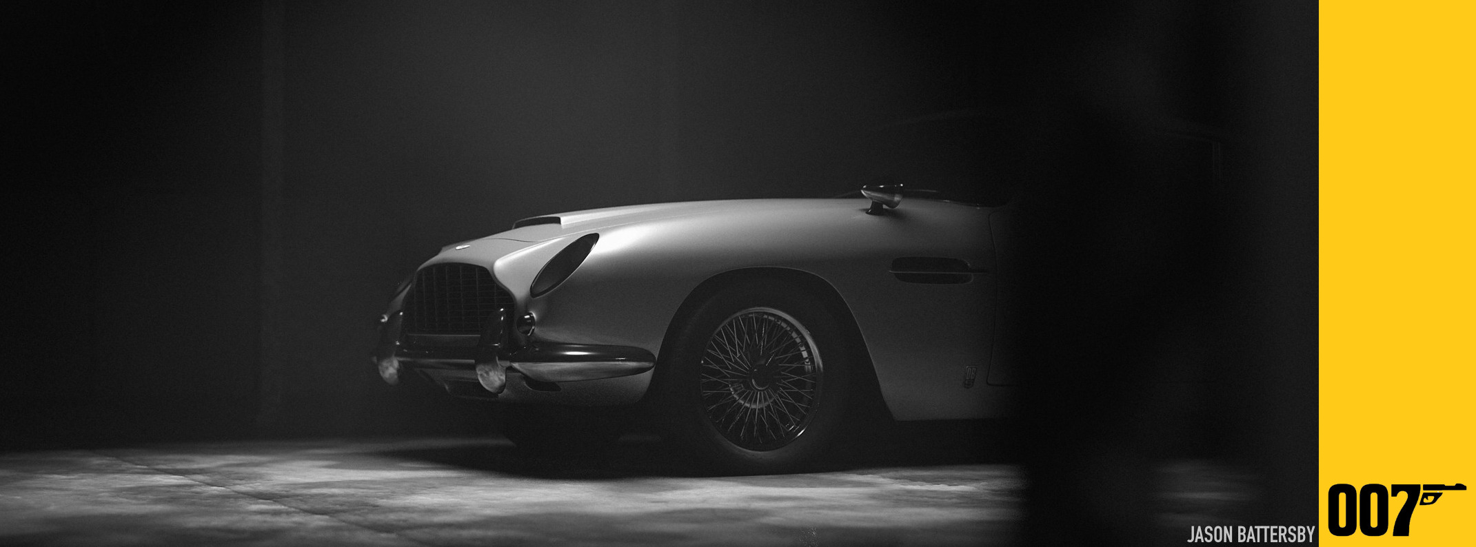
Artist Batt / Jason Battersby digitally re-creates Ken Adam’s Aston Martin DB5 from Goldfinger (2019)
The Spy Who Loved Me (1977) brings different shapes to the Bond canvas. Instead of his trademark triangular perspectives and disappearing detail, Bond ’77 sees Adam bring circles, curves and bubble-shaped trappings to Stromberg’s life aquatic. Blessed with providing our man James with a new car, Adams repeated a pop-culture moment he had already served up a decade before by creating a Lotus Esprit that didn’t just dive beneath the Sardinian waves. It drove kids imaginations across their lounge floor and bath tubs via best-selling toy cars whilst bringing a bit of Derek Meddings and his miniature brilliance to play with the presentation of scale – one of Adam’s key tropes. And when he created a supertanker capable of swallowing three submarines, he didn’t just consult friend Stanley Kubrick – who came quietly into Pinewood one Sunday morning to light the gargantuan set – the set and its new 007 Stage home was opened by the PM, Harold Wilson and saw Bond receive his only ever (so far) Academy Award nomination for Best Production Design. Kubrick’s designer daughter Katharina also worked with Ken Adam on The Spy Who Loved Me – and was supported as a [then] rare female creative in a very male workshop world. The film’s sets are the ones that Bond producer Barbara Broccoli remembers most fondly. It was the first Bond bullet Barbara worked on in an official capacity, and one that was housed in the mammoth 007 Stage built and designed by Ken Adam at Pinewood Studios.

Ken Adam’s own photographs of the 1976 supertanker set for The Spy Who Loved Me / Photos © Deutsche Kinemathek – Museum für Film und Fernsehen
Moonraker (1979) was Adam’s final Bond movie (although he later contributed to EA Games GoldenEye: Rogue Agent (2004) – which he politely remembers as “it wasn’t really filmmaking”). The largest film Adam had worked on, Moonraker and its designer inadvertently found themselves at a lucky point in space history – NASA delays meant Moonraker pre-dated the first manned space shuttle mission by two years. It now gets overlooked just how Adam’s designs, the sublime miniature work and EON’s vision introduced the world to the new era of space exploration before NASA did. Which was apt, considering Ken Adam arguably primed the world in You Only Live Twice for the moon landing of 1969. He certainly made Cold War moonshots commonplace before they actually were. And whilst the easy assumption is Bond ’79 was wanting some of those Star Wars box-office dollars, it was wanting to engage with those younger audiences and their new visual expectations more so. As a lone astronaut floats into Drax’s space station to literally turn on the lights amidst slo-mo shots and John Barry’s classical-minded score, Moonraker is always more Kubrick than Lucas. And over four decades later, Moonraker and Ken Adam’s work on it is a key reason this film remains a good call to introduce to kids unaware of Bond movies.
When he put the lid on his Bond Flo-Master pen for the last time, Ken Adam continued with a final act of great art direction and movie design. For around twenty-five years after Bond, Adam worked with some of the best names of cinema. Marlon Brando (The Freshman, 1990), Herbert Ross, Bruce Beresford (King David, 1985, and Crimes of the Heart, 1987), Norman Jewison (Agnes of God, 1985, and Bogus, 1996), Barry Sonnenfeld (Addams Family Values, 1993), Nicholas Meyer (The Deceivers, 1988, and Company Business, 1991), John Frankenheimer (Dead Bang, 1989), Nicholas Hytner (The Madness of King George, 1993), Frank Oz (In and Out, 1997), Istvan Szabo (Taking Sides, 2001) and legendary producer Robert Evans (The Out-of-Towners, 1999).
He was an initial designer on 1979’s Star Trek – The Motion Picture (then known as Star Trek – Planet of The Titans). His designs for the USS Enterprise alone are arguably all over the designs and titles of CBS’s Star Trek – Discovery. He was also an original designer for the cinematic likes of never-happened The Fantasticks (1982), Bernardo Bertolucci’s The Last Emperor (1987) and William Friedkin’s abandoned Wozzweck (1997). And whilst he had no involvement, one of the most Ken Adam inspired sets is easily the crystalline Fortress of Solitude for Richard Donner’s Superman The Movie (1978). He won the Academy Award for Production Design on Barry Lyndon (1975) and The Madness of King George (1994). The former title and its director’s perfection passions gave Adam a near-breakdown that was sometimes a moot point in discussion afterwards – despite his own fondness and pride for the work.
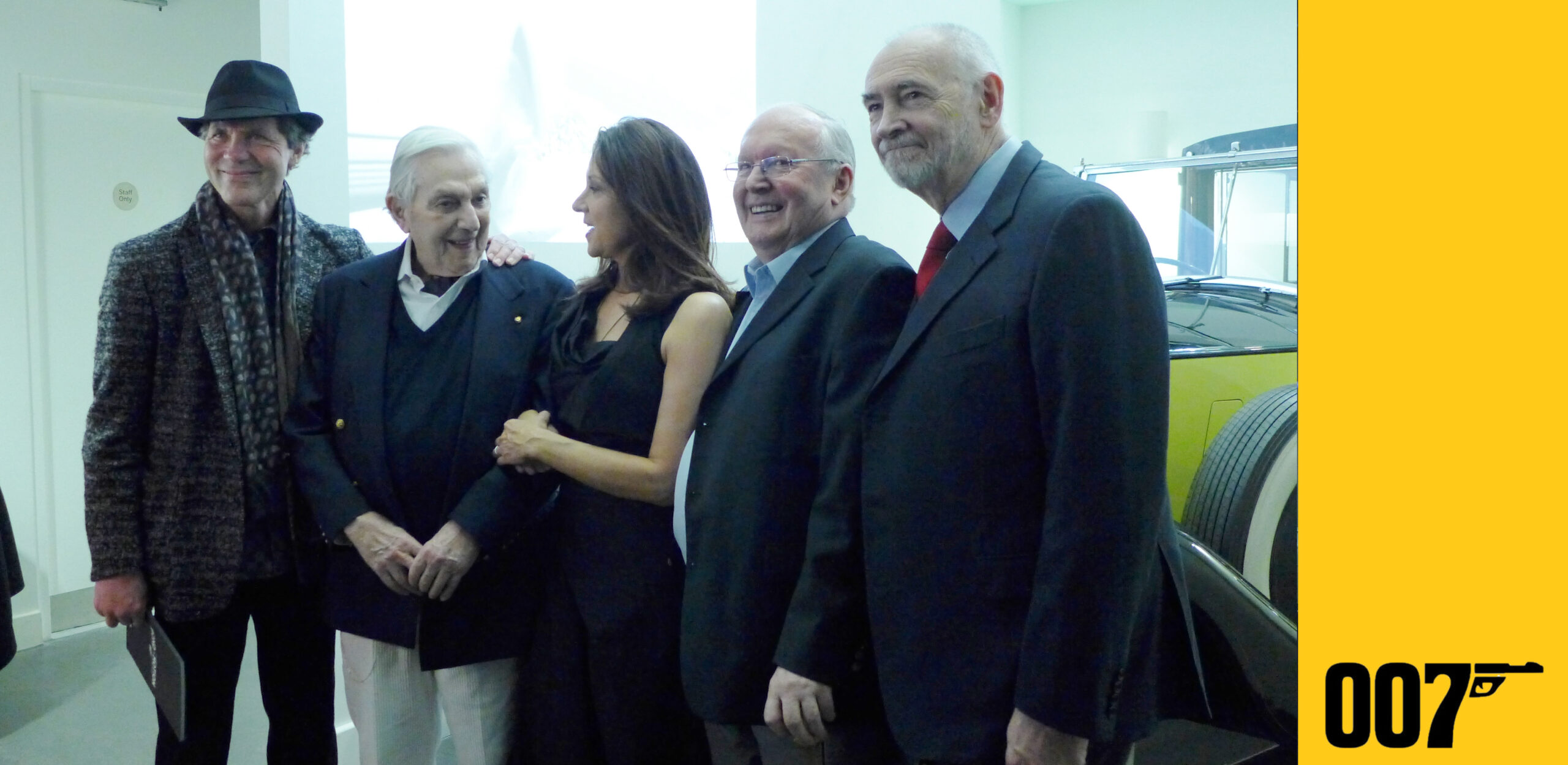
Bond pride as production designers Dennis Gassner, Ken Adam and Peter Lamont join producers Barbara Broccoli and Michael G. Wilson to launch 2014’s Bond in Motion / Photo © Mark O’Connell
This Bond author was fortunate enough to meet Mr. Adam on a few occasions and the mind, contemporary spark and talent was always as sharp as those Flo-Master pens. He attended the Spectre World Premiere in October 2015 and was also on hand in 2014 to team up with fellow Bond designers Peter Lamont and Dennis Gassner to help launch London’s Bond In Motion exhibition – which saw such quiet pride on the part of Bond producer Barbara Broccoli when a vital family friend arrived to bridge Bond old and new with three masters of 007 artistry all too aware the youngest, most incisive mind in the room still belonged to Ken Adam.
Adam has also naturally been the subject of a great many exhibitions, design lectures, film festivals, symposiums and installation tributes. His artistic reach always ensured good box-office and attendance as his contemporary zeal always stretched way beyond the 1960s. In 1999, London’s V&A launched Ken Adam – Designing the Cold War filled London’s V&A and Moonraker, Strangelove and Other Celluloid Dreams – The Visionary Art of Ken Adam filled The Serpentine. EON Productions own touring exhibition Designing 007 – Fifty Years of 007 Style (2012) naturally presented original Adam sketches and his showmanship filled all of the zones dedicated to the artistry of Bond. And Washington DC’s Exquisitely Evil – 50 Years of Bond Villains was a long-standing testament to Adam with exhibition zones wilfuly echoing the minerals and metal of Ken Adam’s interiors – and not a million miles from The White House (where Bond films have always played – including Adam’s Goldfinger, which President Carter watched when he lost to Ronald Reagan in 1980 and who, in turn, was famously amazed the war rooms never resembled those that Ken created for Dr. Strangelove).
However, it was 2014’s Bigger Than Life – Ken Adam’s Film Design that saw Ken’s own story go full circle. Housed in Berlin’s rather beautiful and wholly contemporary Deutsche Kinemathek centre, the sizeable exhibition also marked the film museum’s 2012 pledge to safeguard and preserve all of Ken Adam’s work. Over 4,000 items make up the collection in a movie city that not only bore Adam himself in 1921, but is one of the founding historical beats of movie design and German cinematic expressionism. It is no irony that Ken Adam’s very own drawing style echo Robert Wiene’s Das Cabinet des Dr. Caligari (1920) and its grey contouring and sense of disappearing shapes and menacing shade.
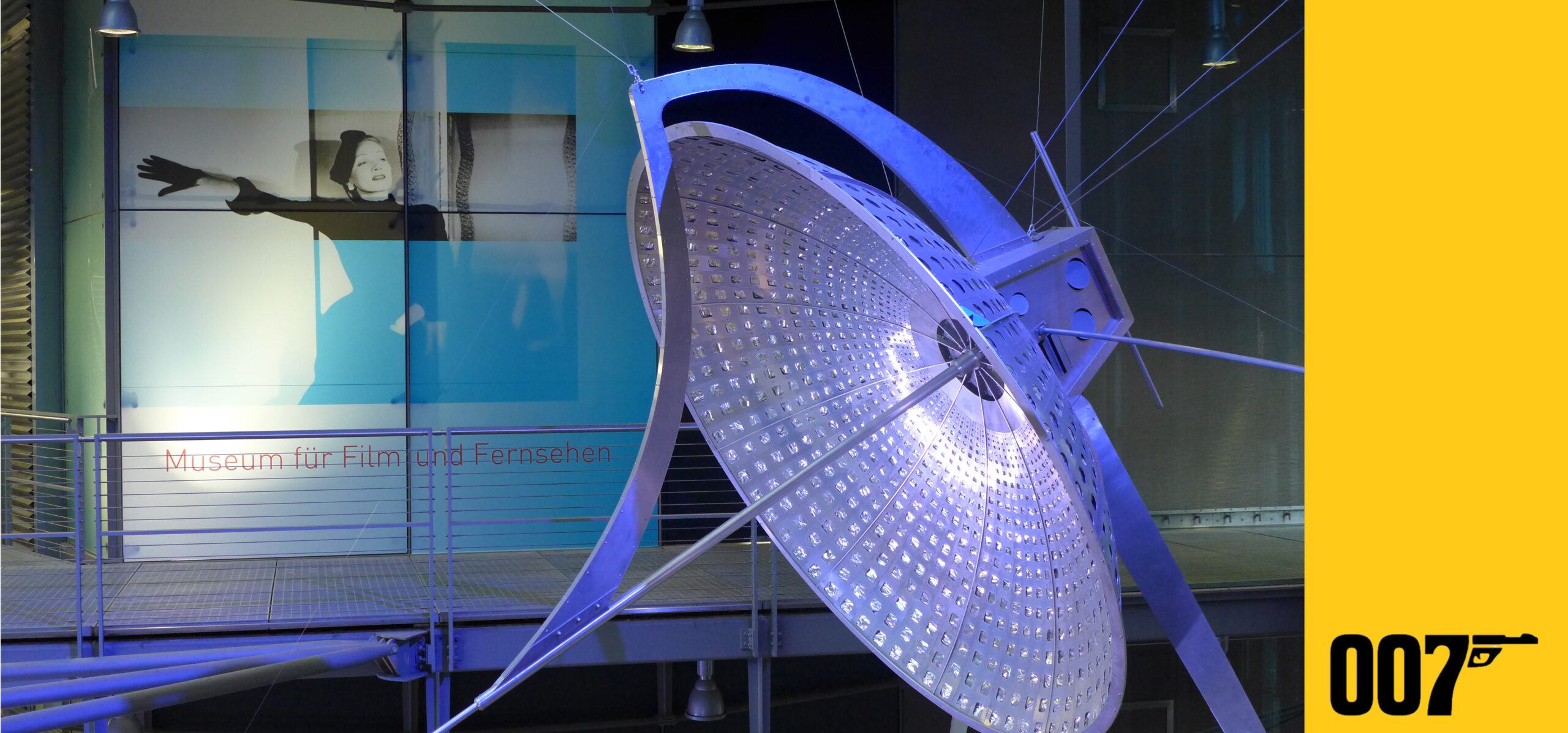
Aptly watched by Marlene Dietrich, Ken Adam’s diamond satellite from Diamonds are Forever hangs in Berlin’s Deutsche Kinemathek – Museum für Film und Fernsehen / Photo © Mark O’Connell
As well as Pixar’s The Incredibles (2004) and its 2018 sequel, Ken Adam is all over many new works, shoots, promos and productions. As the world continues to fall in love with the retro artistry and design choices of The Queen’s Gambit (Netflix, 2020), its co-designer Uli Hanisch proudly acknowledges his fascination for Ken Adam. It is an influence wholly visible in nearly every set and bespoke frame that even has shop fronts paying deliberate homage to Ken – and the very ancestry of the Berlin locations vividly doubling up for Cold War Moscow, Paris and Washington.
However, just as Ken Adam’s movie artistry continues to reach from the 1960s to today, so too do his influences off the silver screen. Adam also defined what modernity itself was, what it looked like, and what it could be. Take a look through any number of post-war design projects and Adam’s charcoaled fingerprints are all over them. In 2000, he created a structural centre-piece for Berlin’s Millennium Exhibition and numerous commercial commissions not always movie related. One can sense Adam’s grip on the streets of Berlin, Japan, London, Los Angeles, New York and beyond. Many a new airport terminal, parliament lobby, underground station, financial center, suspension bridge, rock concert gantry, Olympic stadium, bespoke car showroom, Vegas heritage museum, pharma HQ and city cultural space owes many Flo-Master debts to Ken Adam. 2019’s Secret Cinema presents Casino Royale may have not have had his name on the credits, but its marked sense of movie production design meets immersive performance space was wholly Sir Ken.
Famed architect Sir Norman Foster is a self-declared Adam devotee. London’s Canary Wharf subway station was Foster’s nod to the Liparus supertanker from The Spy Who Loved Me. That notable and sizeable reverence in turn pushed Ken into the Star Wars franchise when Rogue One chose to shoot amidst the Adam-minded escalators and metal work. The Ken Adam linkages return to the galaxy when 2025’s Andor Season Two shoots its Moonraker style locations at Norman Foster’s McClaren Technology Centre in Woking, Surrey (ironically mere minutes from Horsell Common – where sci-fi’s elder H.G. Wells set the first alien invasion in The War of the Worlds). The McClaren location yielded not only two seasons worth of a Corsucant space port for Andor. The site’s OKX Thought Leadership also doubled up as the ISB’s Operations Room – where Foster’s existing space holds great design echoes of 1979’s Moonraker, Adam’s early sketches and maybe the nearest we get to Drax Vader flying off in Moonraker Sith. Can we all just take a moment here to fathom what brilliance Ken Adam’s Death Star could have yielded had Roger Moore not enlisted him into space first?!
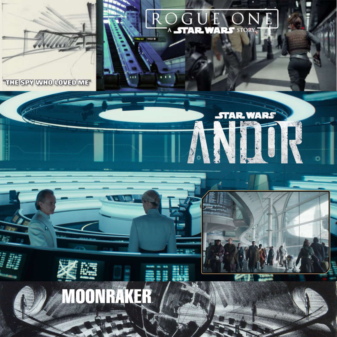
“He is in the tradition of those theoretical visionaries…his control of light and space and drama – these great caverns…. that’s Ken. He’s the architect.”
Sir Norman Foster
One of the most striking and aptly cited Adam inspirations is Norman Foster’s Reichstag Dome in Berlin. Adam once told the Refugee Voices archive that, in 1933, ‘I still, on my way to school, saw the burning of the Reichstag. That I witnessed’. Sixty years later, Foster was tasked with replacing the famous Dome. As soon as you step into Foster’s magnificently domed glass observatory that takes in a large swathe of Berlin and its surroundings, one can feel and almost taste Ken Adam’s work – especially his EON work for The Spy Who Loved Me and Moonraker.

Foster’s Reichstag Dome and its uncanny Ken Adam influences / Photos © Mark O’Connell
Forty-two years since Ken Adam last worked on Bond (1979’s Moonraker), Mark Tildesley’s production design for No Time to Die (2021) is all about kneeling at that granite altar of both reference and reverence. From the pared down elements of a Jamaican retreat mindful of its sparse placement, local timber, ceiling shadows and living quarter depths of field echoing Dr. No, to futuristic gliders straddling the crafts and production kit of Thunderball and Moonraker, a colonial Cuban street, that DB5 and a jagged, triangular-wise lair granite-hued replete with all its The Spy Who Loved Me influences.
“The cinema is there to heighten the imagination. I have always tried to make sure it does.”
Ken Adam
A collection of Ken Adam documentaries, tributes and interviews :
Ken Adam “Cold War Modern” on Vimeo
Ken Adam – Evacuating Nazi Germany
Sources :
Ken Adam & Christopher Frayling / Ken Adam Designs the Movies : James Bond and Beyond, Thames & Hudson
Mark O’Connell / Catching Bullets : Memoirs of a Bond Fan, Splendid Books
Deutsche Kinemathek – Museum für Film und Fernsehen
